This February, we have noticed some essential web design trends. Some are purely aesthetic, while others are focusing more on cool JavaScript and in the user experience.
From a distinct photography style to shapes and colors, here’s what’s trending this month from your Dallas web design experts:
1. Circles
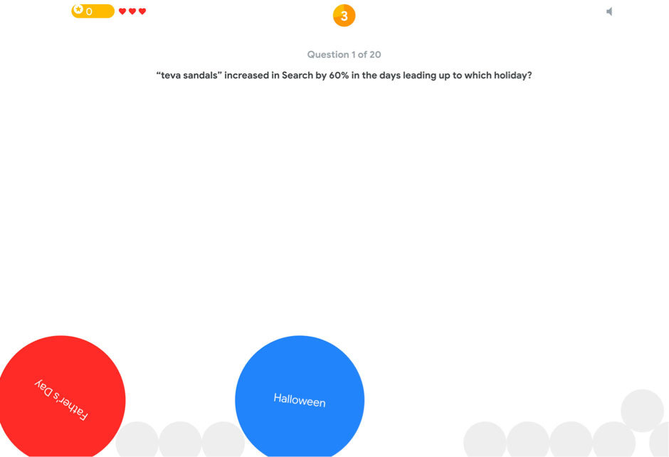
The use of circles in web design is not new. The so-called “perfect shape” is part of Google’s Material Design standards and is aesthetically pleasing to the eye. Surely, you have noticed those circular buttons.
When you incorporate circles in your web design, it’s essential to ponder on the meaning of this shape, as it can give your design an added layer of content. For instance, Google’s Game of the Year makes use of circles so that users will be prompted to click on answers to game questions.

2. Black and White
This design pattern is both classic and timeless. They exude a feeling of elegance that makes them a popular choice.
The majority might think about using this design pattern on photos, but the design can extend to other design elements such as typography, navigation, and videos.
The richness of the black and white pattern allows for visual depth, and you cannot argue that the lack of color in this pattern makes it stand out. Black and white helps bring focus and attention to the messaging. It also creates a particular emotional feel.
With black and white, there is no right or wrong choice. The decision to incorporate an accent color is dependent on what you want the user to do, as well as the experience that you want the user to take from it.

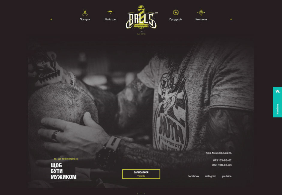
3. Photos that are ‘Faceless’
The faces of people in photos help users connect and engage. Then why is there a trend on using faceless photos?
This web design style’s purpose helps allow users to imagine themselves on the photos displayed. You might be the person eating a scrumptious meal, or that person getting a cool haircut.
This web design trend might be effective, but it doesn’t work for everything. It’s best to use this concept for designs that don’t require a strong emotional response.
Faceless photos can also work for you if you use a lot of stock images. It can conceal the faces of the stock models so that your design doesn’t appear too canned.

Feel free to incorporate these web design trends into other elements. What trends are you loving right now? We at D6 Interactive, your Dallas web design specialists, would like to see some of the websites you’re fascinated with.

