2020 is just around the corner! It’s time to start planning: how can you refresh your website so you can meet the latest demands in website design?
The past years have seen never-ending open tabs and push notifications, so it’s not surprising that soon, website design will be all about clarity of use and intuitiveness. In an environment that’s flooded with stimuli and information, we look forward to websites that stand out by delivering their messages in an uncluttered, clear manner.
D6 Interactive, your Dallas web design company, explores the most stunning website design trends to watch out for in 2020. Use these as an inspiration to help you create websites that are up-to-date!
1. Bold, oversized typography

Websites today are favoring prominent, bold elements. This applies to just about anything on a webpage – from full screen videos and images, oversized menu icons, to huge, bold typography.
Bold elements are not only eye-catching, it helps the website visitors know what your website is all about right off the bat. Plus, they look awesome on any screen size!
When applying this trend, it’s best if you reduce the amount of design elements on every page. Putting an overwhelming amount of features all at once can be counterproductive and overwhelming.
2. Split content

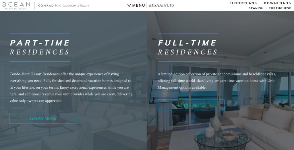
Do you have a number of ideas you want to convey, but are still aiming for that uncluttered look? Try splitting your screen, allowing both sides an equal spot in the limelight.
This technique will help you showcase more than one essential message on a single page. Not to mention that this will allow your site to look more well-organized and appealing.
Add some pizzazz and make each half behave differently. One side can move at a different pace while you can play around with scroll effects for a surprising asymmetry.
3. Lots of whitespace

Negative space, more commonly known as whitespace, refers to the blank areas between the design elements. It can help give your site a well-balanced, spacious feel. This includes the space around the visuals, the spacing between columns of text or lines, as well as the margins around the page.
Whitespace helps highlight vital design elements like call-to-actions, boost legibility, create an overall pleasing and tidy appearance, and separate independent sections efficiently. In short, it’s a breath of fresh air.
Sure, whitespace has always been one of the top design principles, but this upcoming year, we are seeing whitespace growing bigger and more distinct. We are predicting harmonious designs with images that look like they are floating freely in space, and clean, expertly-done typography. The result is an immaculate design yet far from minimalistic, as the visuals are striking and bold.
Take your website design to the next level
If you want to give your site the power of these latest transformations, feel free to contact us at D6 Interactive, your Dallas web design company. We can provide you with the best designing service in the industry that will surely meet your business’ needs.

