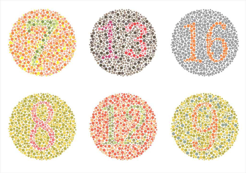
Color vision deficiency, or its simpler term, color blindness, affects about 200 women and one in twelve men across the globe. This means that a lot of people experience the content in your site differently than you’d typically expect.
How can you make sure that your website appeals equally to all users? We at D6 Interactive, your Dallas web design specialists, are here to help. Before you talk to your design department in a panic, consider our list of things that you should consider when designing a website for color accessibility.
What is color blindness?
The typical color blind person is able to see things just as vividly; the only difference is their ability to identify blue, red, or green light. This deficiency stems from a mutation in their X-chromosome.
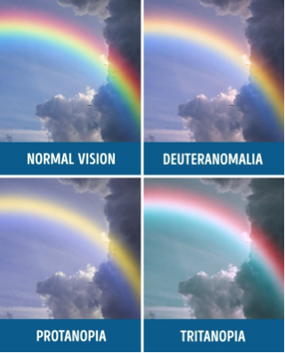
The most common type of color blindness is red or green color blindness. Here, the person with red/green color blindness mix up colors which have green or red as part of the whole color. Those affected by Deuteranopia are less sensitive to green light, while sufferers of Protanopia color blindness have the same issue with red. Tritanopia is the third type of color blindness. This is the least common and refers to those who have difficulty identifying blue or yellow light.
As an example, this is how the rainbow may look like to those with color blindness.

Designing for the Color Blind
You might be wondering: Why should I make adjustments to my website for a relatively small group of users? Good question. You might be surprised to know that the elements that are advantageous to color-blind users are in fact, good website design practices. If your website is well designed, it should cater to all users.
Don’t worry, you don’t need to sacrifice the aesthetic integrity of your site to design for accessibility. Here are some of the elements that you should consider, and hopefully, implement.
1. Use both symbols and colors
When conveying a message, do not rely on color alone. Consider that some kinds of color blindness make it impossible to identify red error messages. When you need to alert your users to things that require their immediate attention, use both symbols and colors. Facebook is a great example.

2. Keep it minimal
The fewer colors you use, the fewer room there is for confusion. Limit the color palette you use. Minimalistic website design is not only aesthetically pleasing, but timeless as well. Plus, it is useful when you are designing with color accessibility in mind!

3. Avoid these color combinations
Be smart when choosing your color combos. Keep in mind that color blindness affects people in various ways, so it’s hard to identify which colors are safe to use. Here are some of the color combos you should avoid, since they can be a nightmare to some color blind sufferers.
- Green and brown
- Green and red
- Green and blue
- Green and purple
- Blue and gray
- Yellow and light green
- Green and black
- Green and gray
Web designers should make websites that are user-friendly to all. If you need help with creating a website that is designed for better color accessibility, feel free to contact us at D6 Interactive, your Dallas web design experts.

